Telus is a Canadian telecommunications company that provides a range of telecommunications and entertainment services to consumers and businesses. They offer wireless and wireline voice and data services, Internet and television services, as well as healthcare and security solutions. Telus wants to shift the demand for SHS by improving Hardware presentment and addressing users' pain points.
Project link

UX Designer
UX Designer
Competitive audit, User flow, paper and digital wireframing, low and high-fidelity prototyping, conducting usability studies, accounting for accessibility, iterating on designs and responsive design
May 2021 to August 2021.
November to January 2023
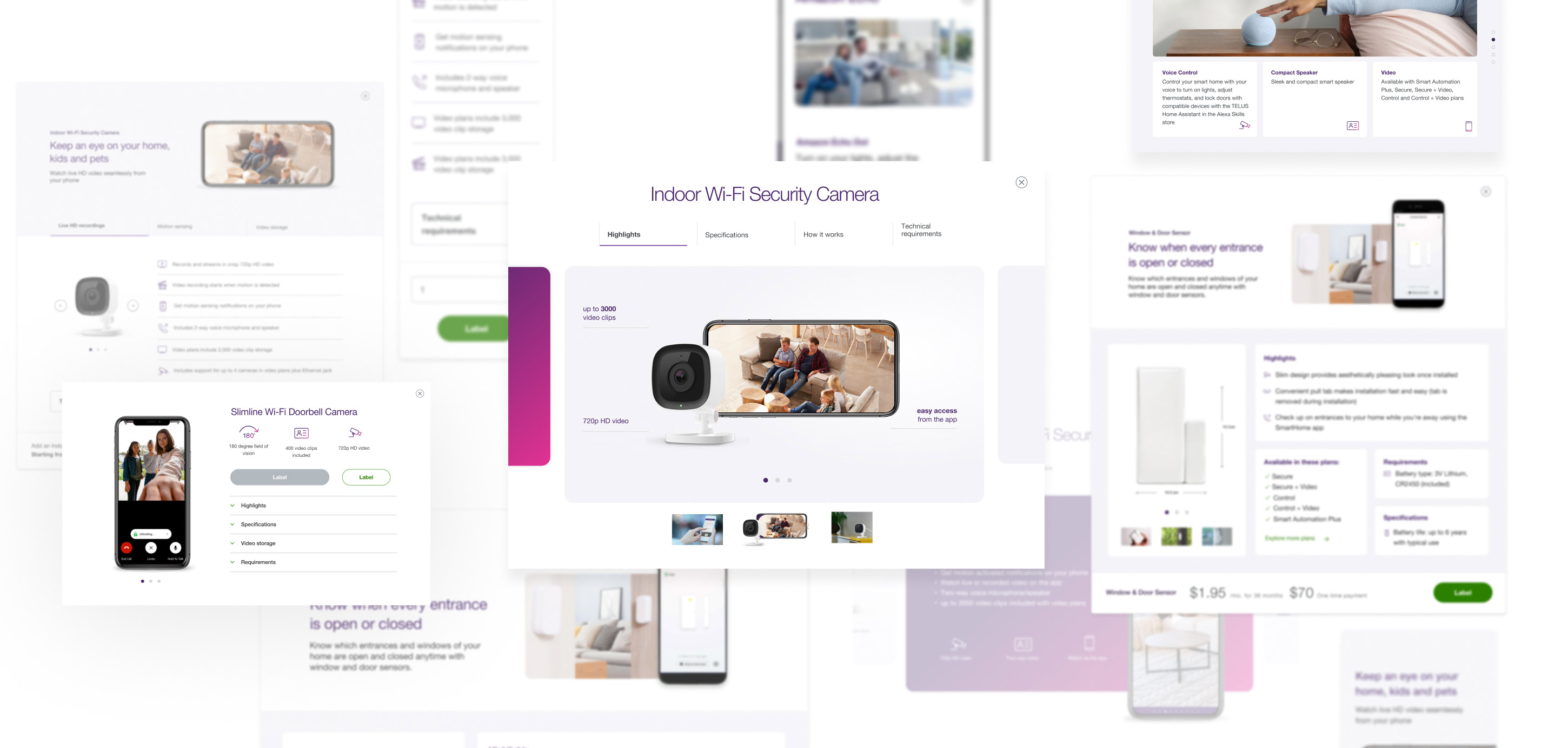
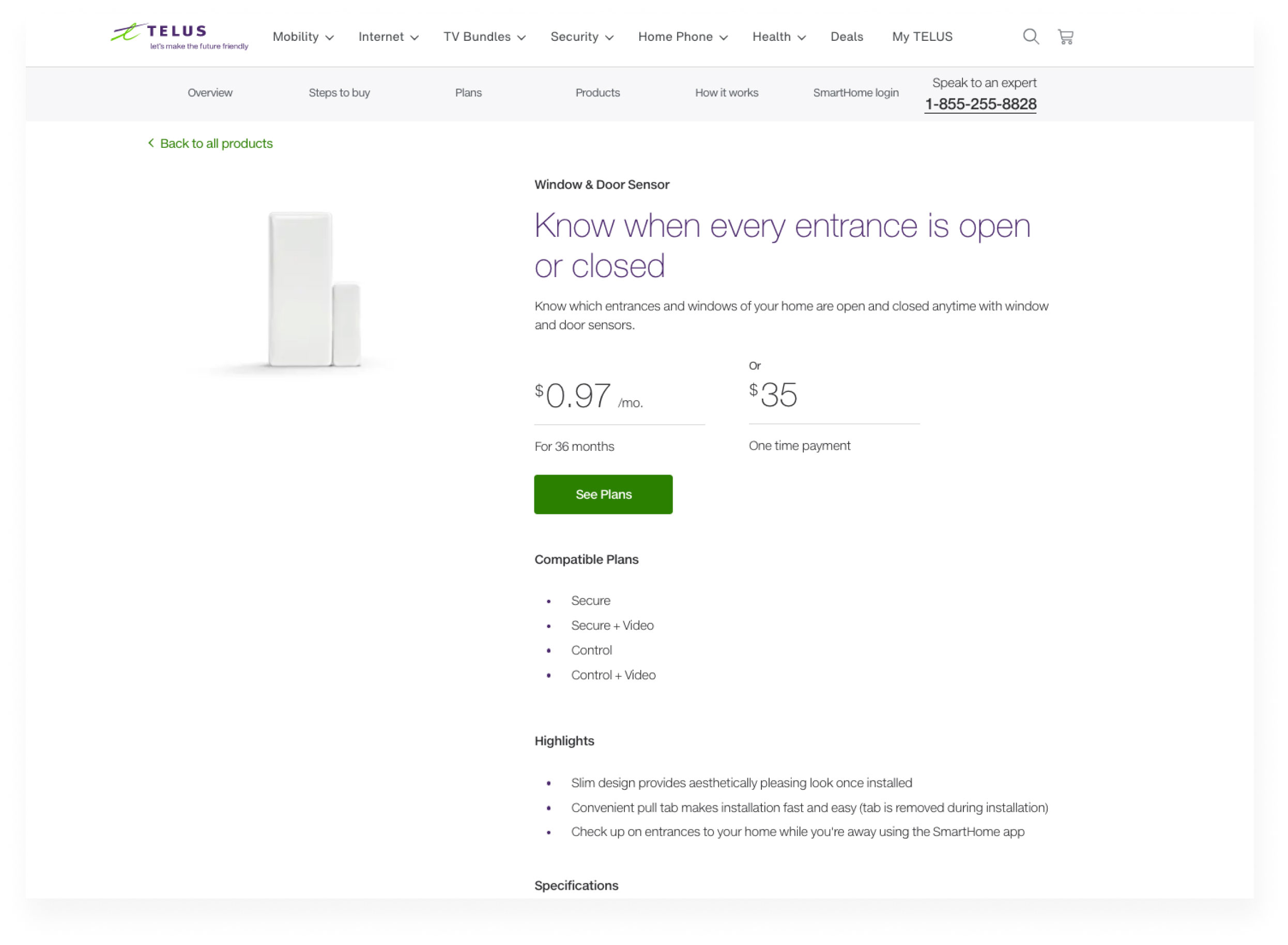
After creating multiple modal options, it became evident that the current solution is insufficient and needs to be reconsidered.
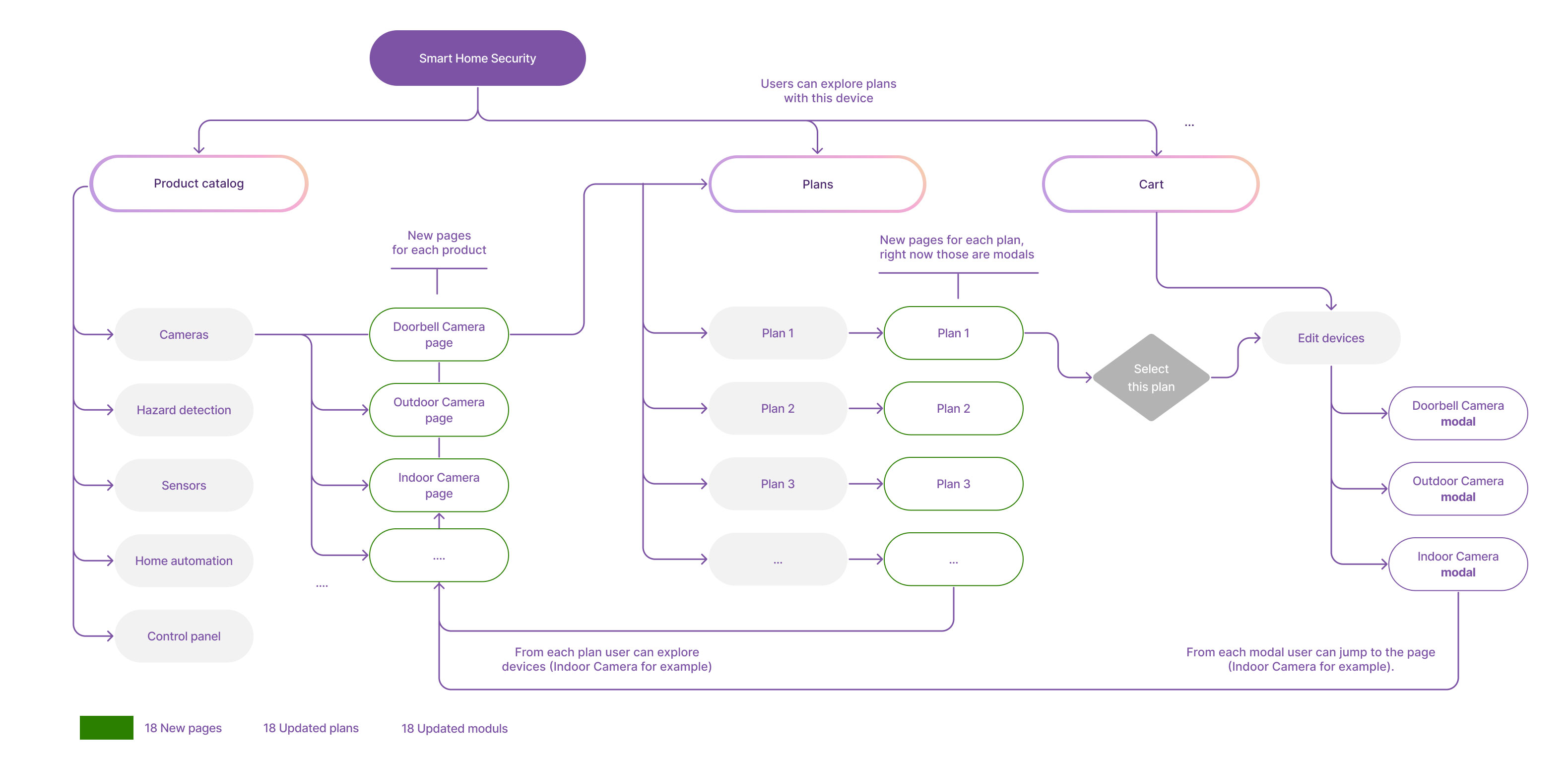
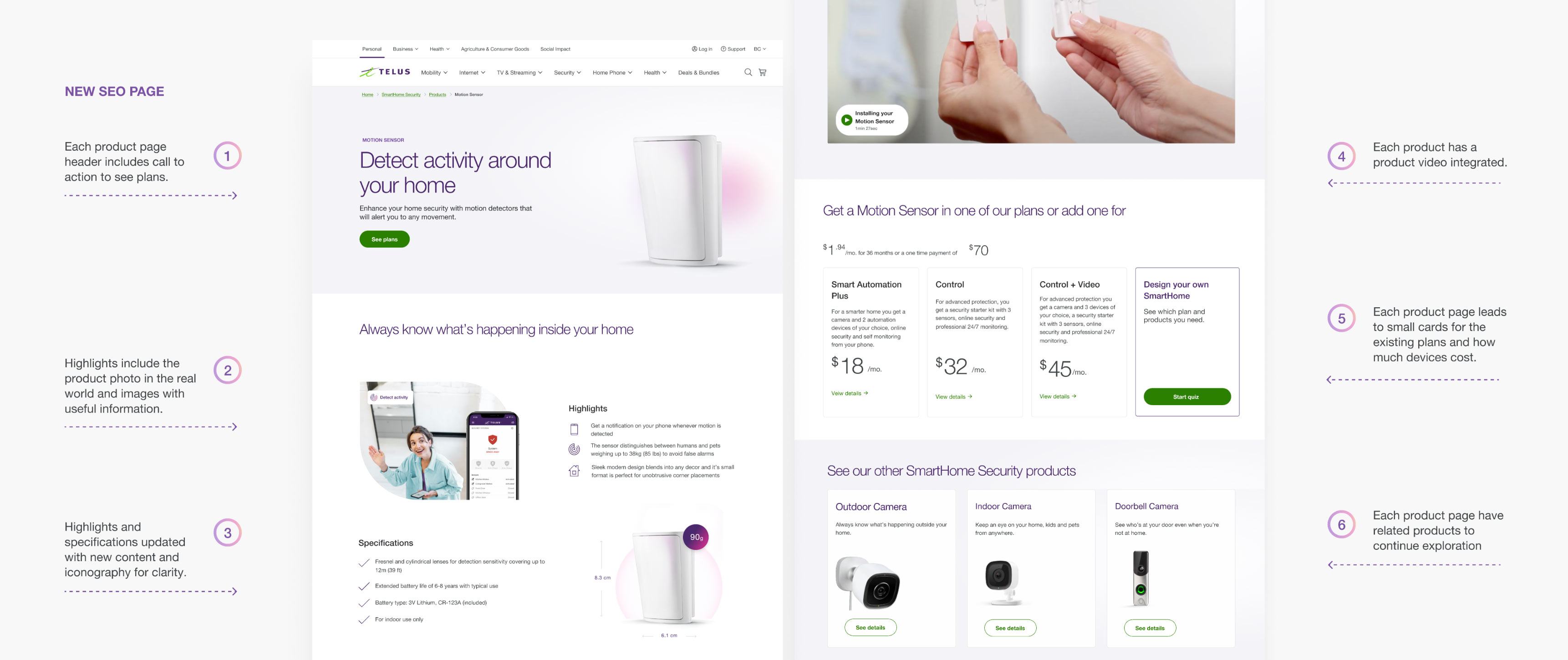
To optimize the effectiveness of the solution for users, I proposed designing new SEO pages that specifically target users' pain points. As a result, this suggestion will prompt the creation of a new user flow that incorporates 18 new pages, along with an updated catalog and modules.
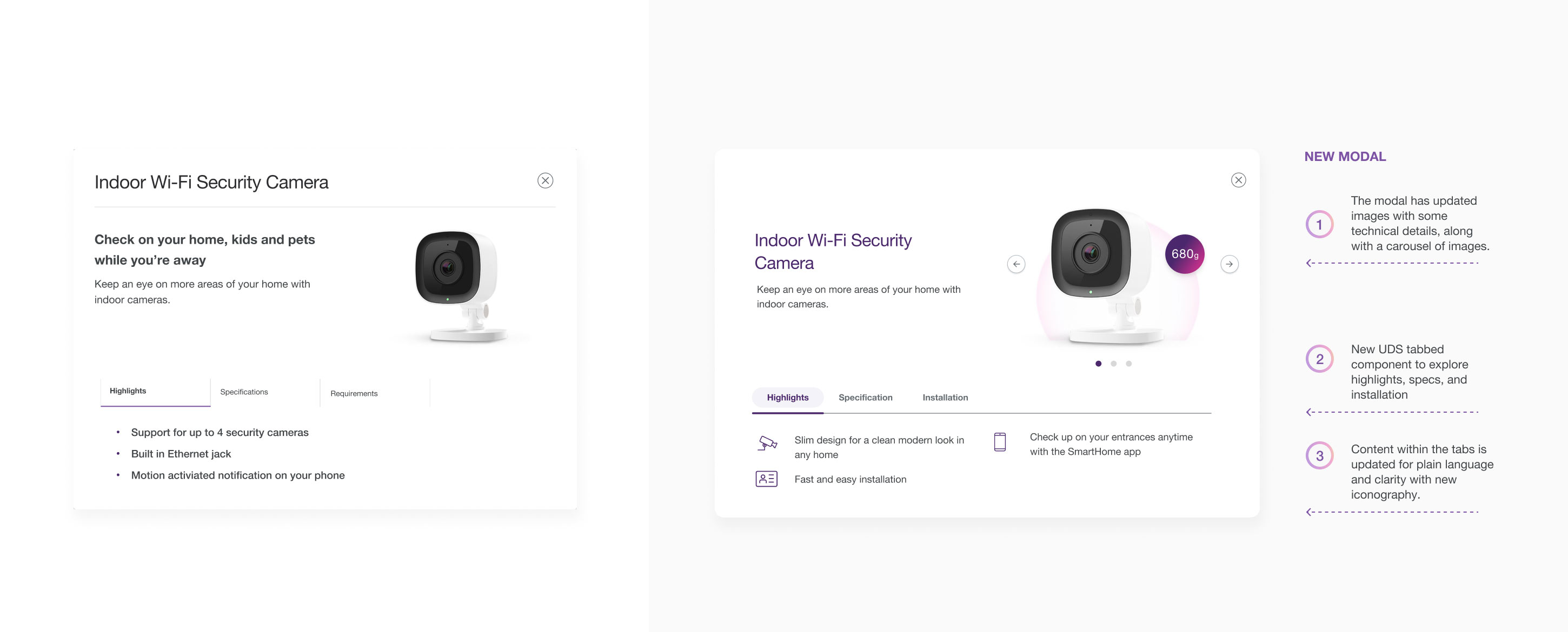
After exploring new modal options and presenting them to Telus, we collectively decided to opt for a more efficient solution. I focused on updating crucial elements, such as the carousel of images, the UDS tabbed component, and the content within the tabs. We made sure that the language used in the content was clear and concise and incorporated new iconography to improve clarity for the users.
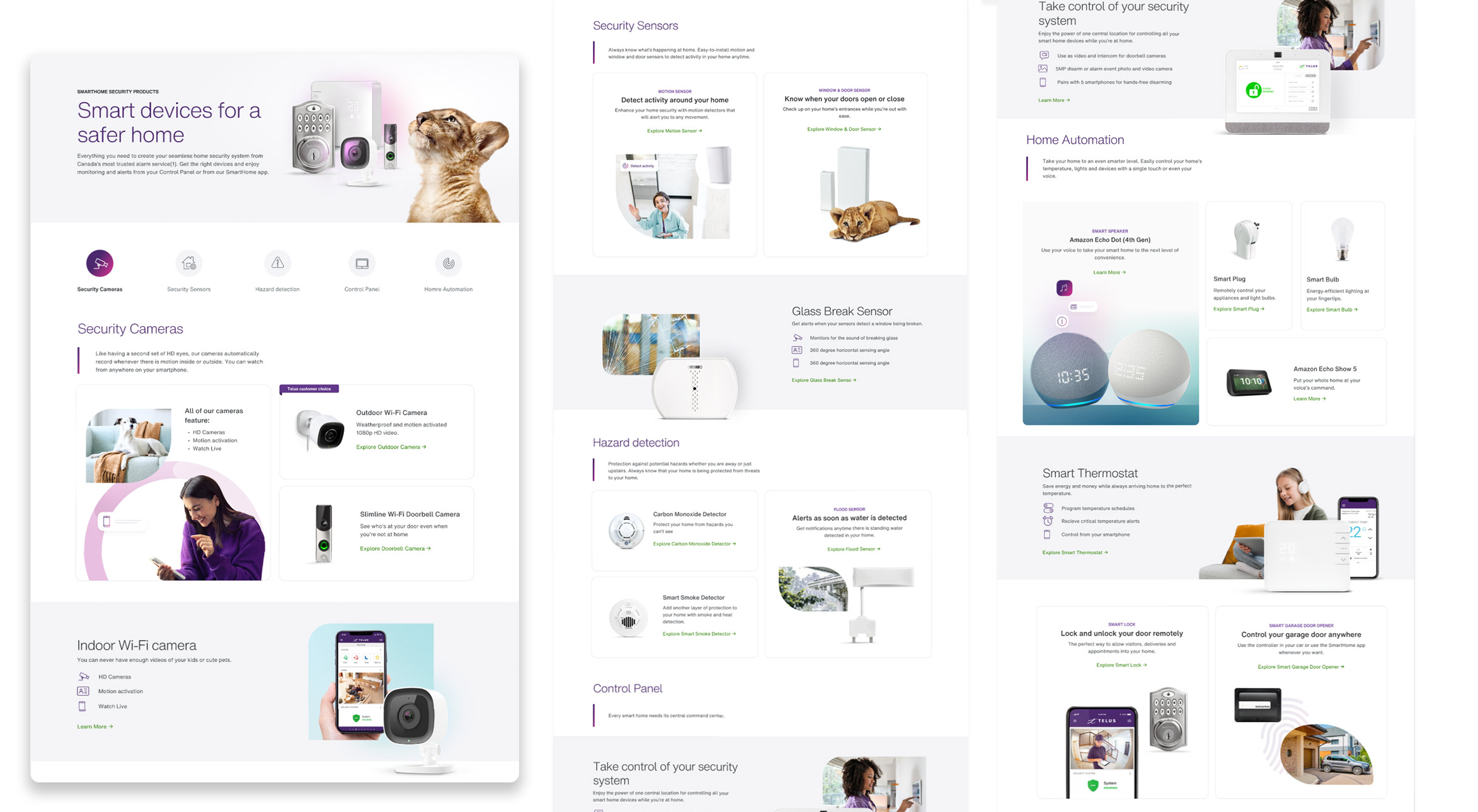
The new SEO page addresses all the users' pain points and provides a clear hierarchy for easy scanning.
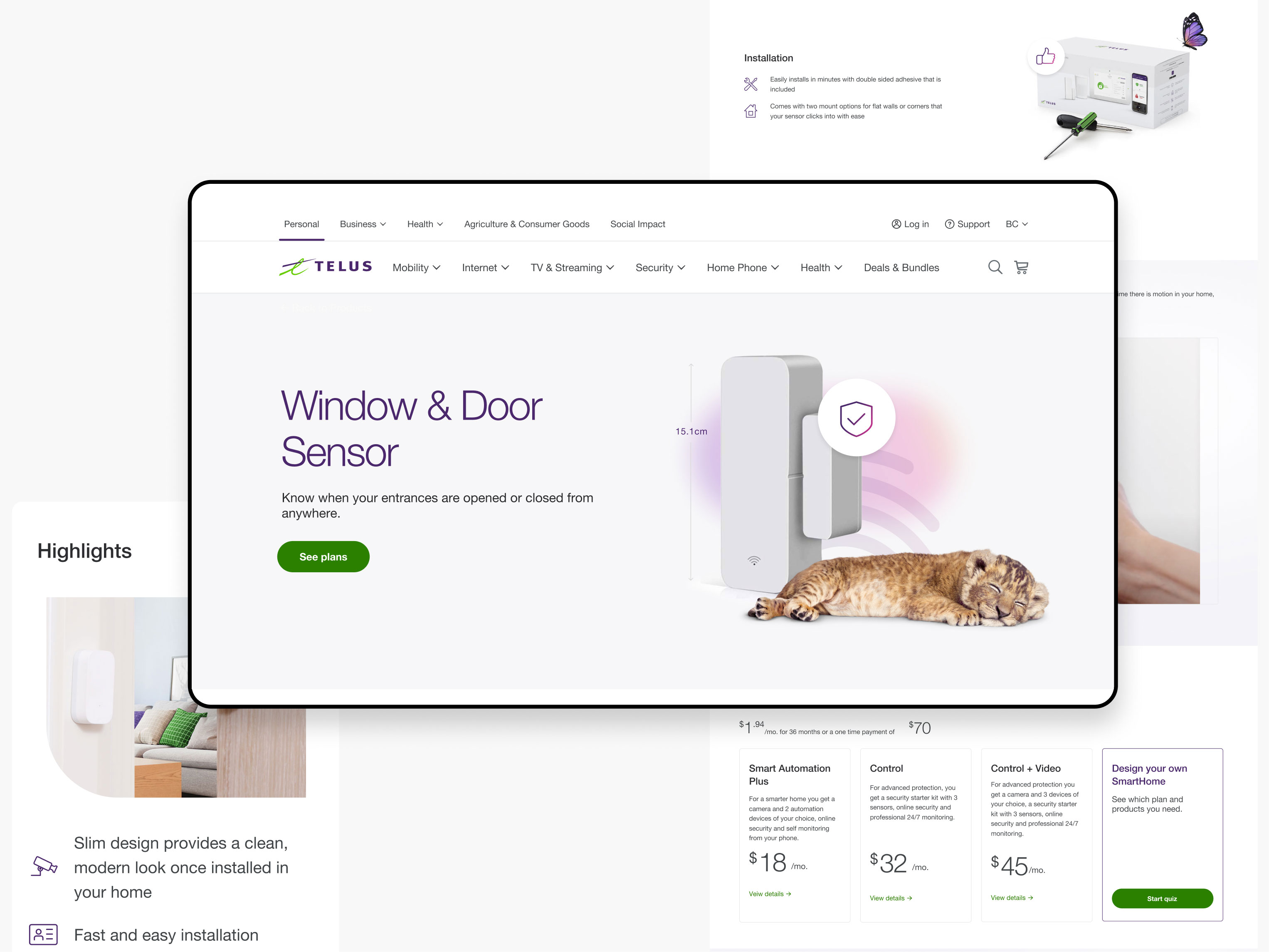
Compared to the existing SEO page, the new one keeps users engaged by providing more information and images about devices and plans, as well as addressing their pain points.
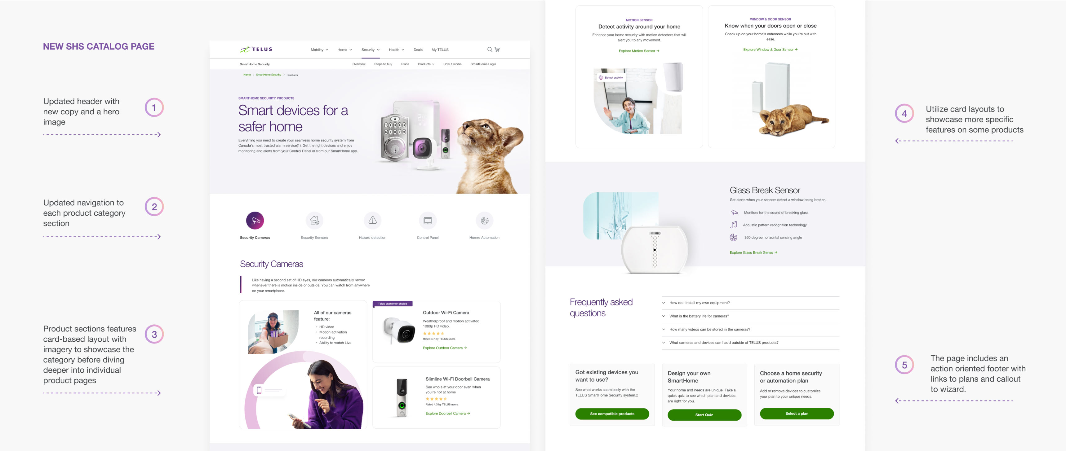
The new Products page (R&L) features a card-based layout with imagery that showcases the category before delving deeper into individual product pages. This new layout highlights specific features of some products and includes an action-oriented footer with links to plans, as well as a callout to a wizard that helps guide users through the process.
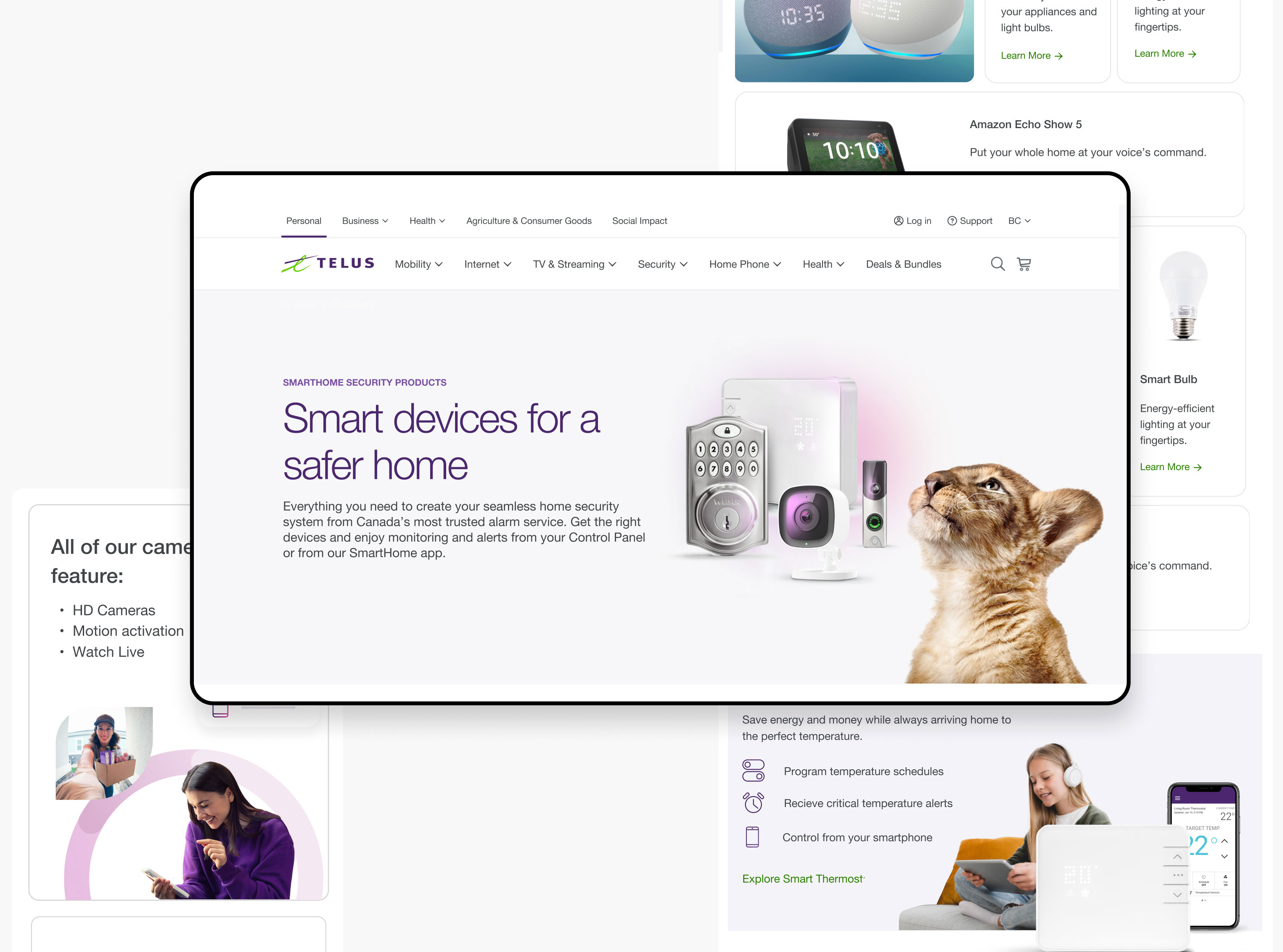
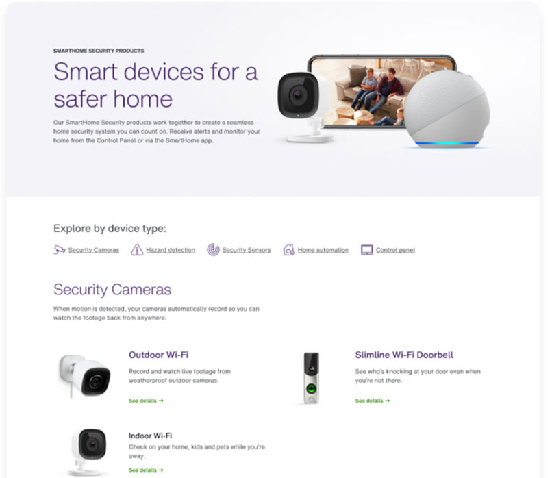
The new Products page has an updated hero banner with new copy and images, as well as an updated navigation and new layout.
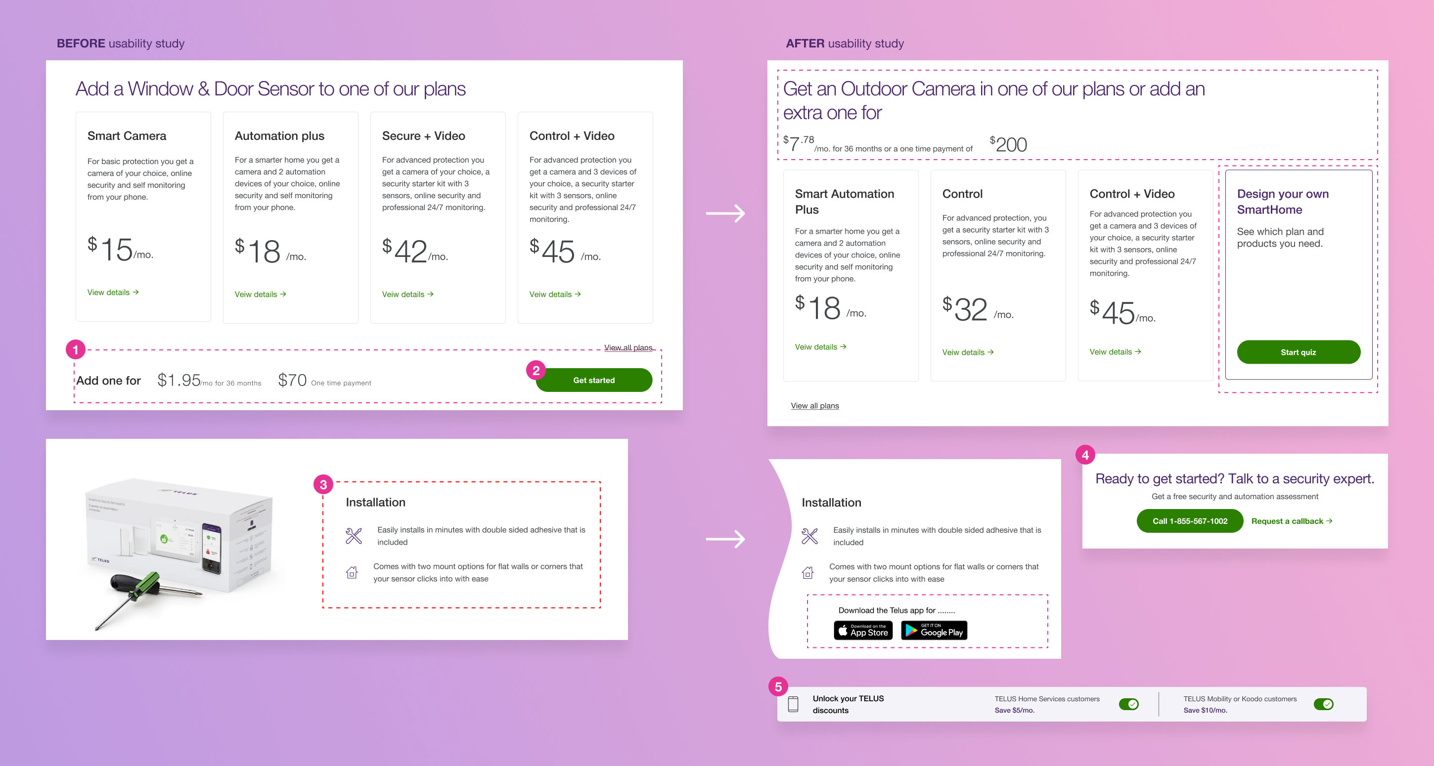
After conducting a usability study, it was revealed that users have some difficulties understanding pricing and are confused about the "quiz" sector.
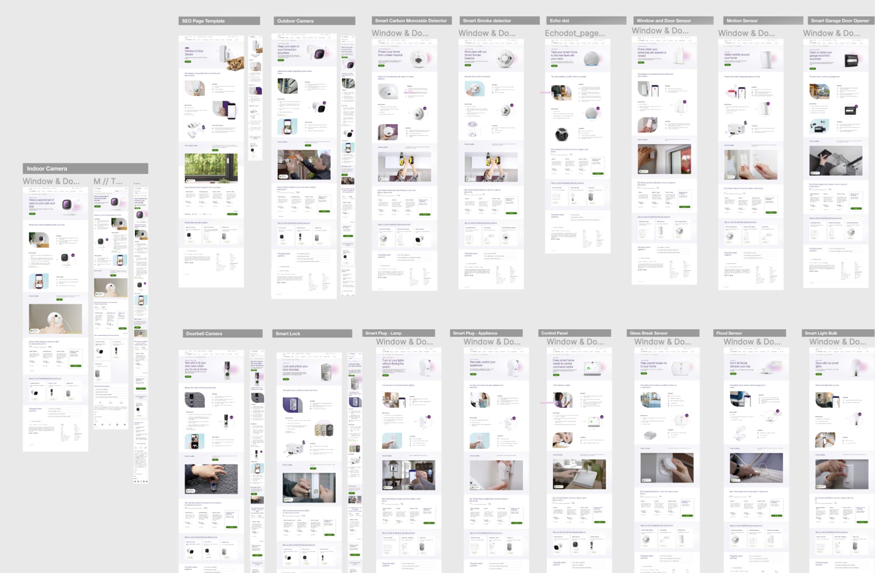
After revising the Product SEO Page, I applied the same concept to create 18 new pages for each device. Additionally, I updated the plans and made tweaks to the product pages.
If it’s a billboard ad, you’ll need a super catchy headline and simple design due to the speed at which people will pass.
Buy Now | $79Impact: Our target users shared that the design was intuitive to navigate through, more engaging with the images, and demonstrated a clear visual hierarchy.