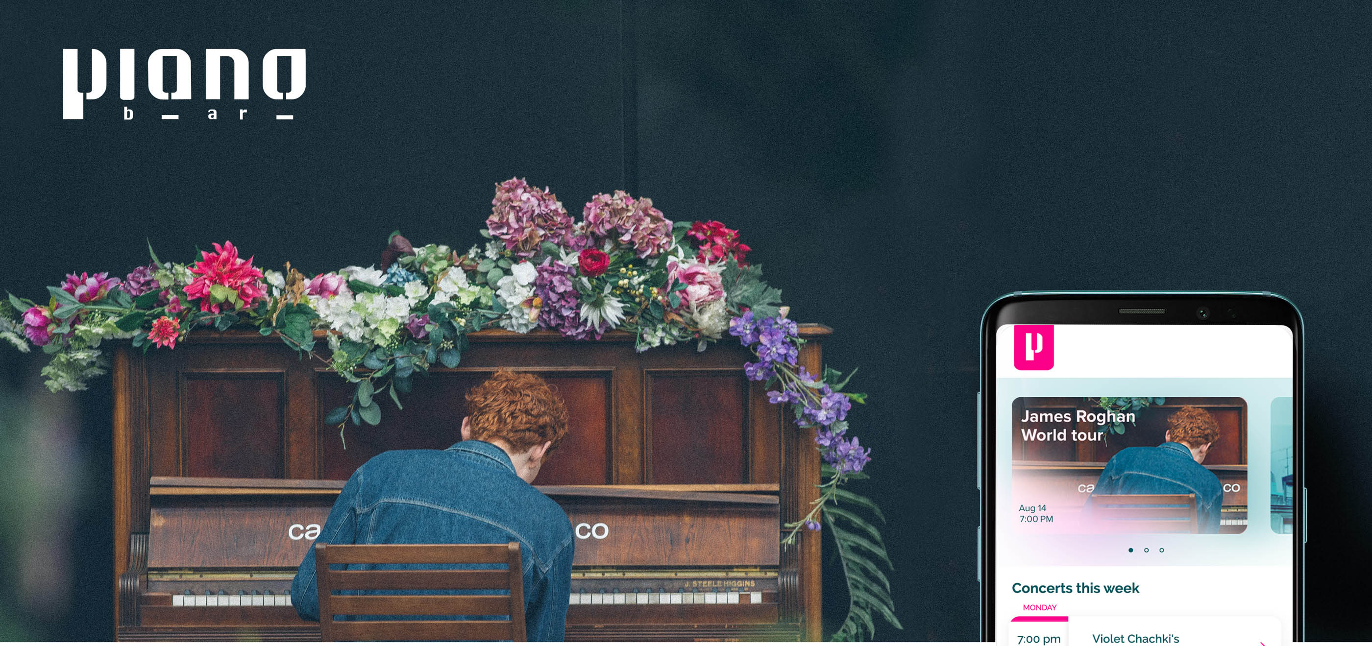
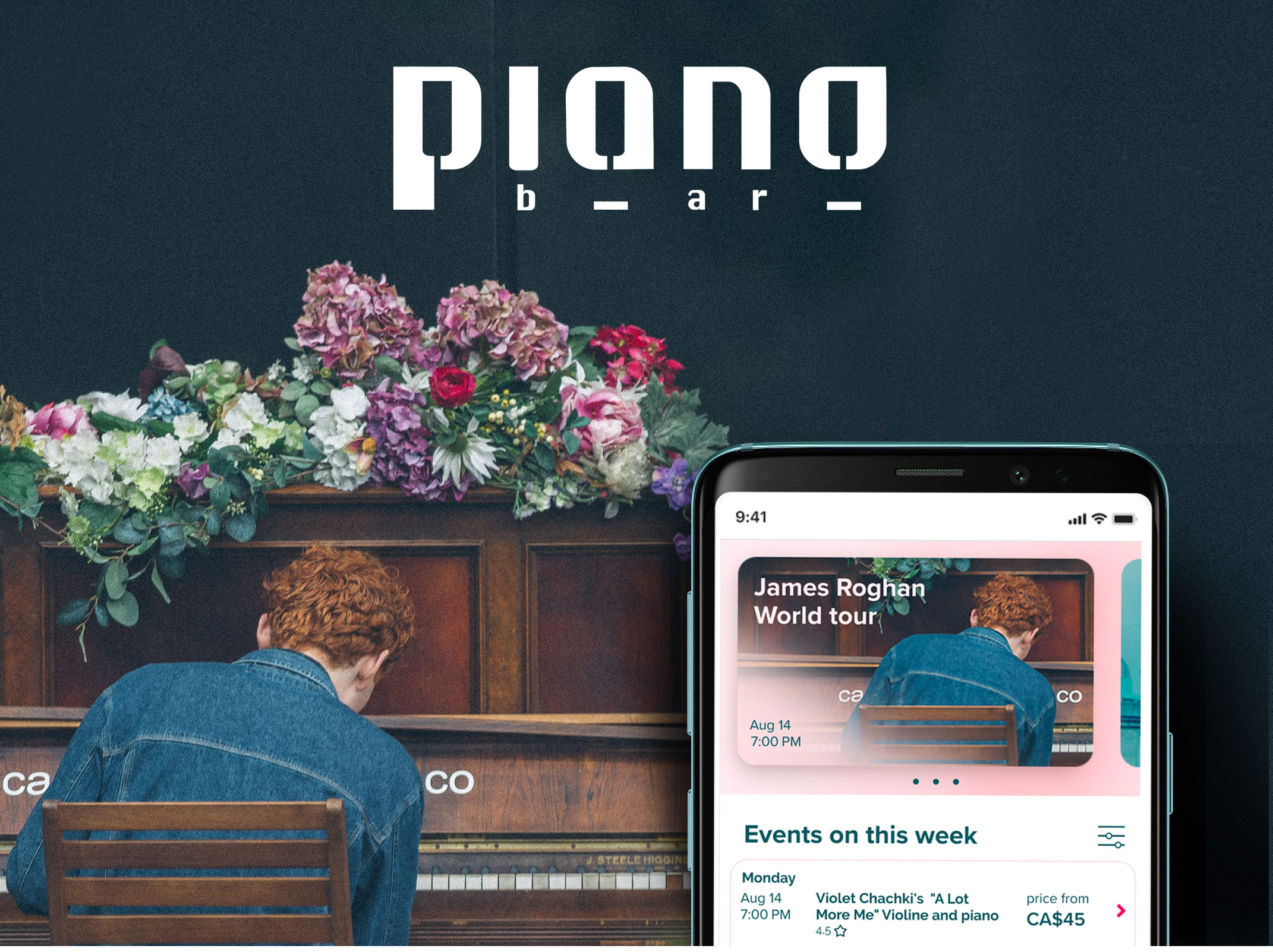
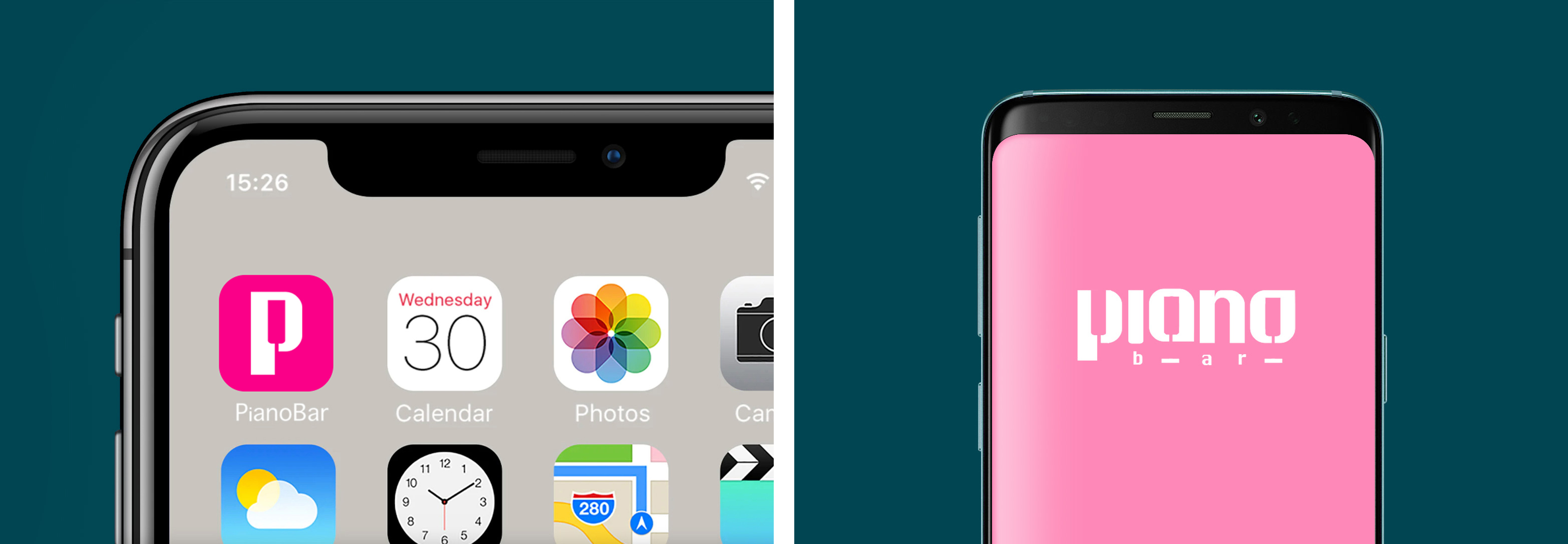
PainoBar is a local Piano Lounge, which is located in the suburbs of Toronto Down Town. They offer the piano concerts of local musicians on regular basis. They target customers who value piano music and prefer competitive prices.
UX Designer
UX Designer
Conducting interviews, wireframing, low and high-fidelity prototyping, conducting usability studies, accounting for accessibility, and iterating on designs.
May 2021 to August 2021.
May 2021 to August 2021.
I conducted interviews and created empathy maps to understand the users I’m designing for and their needs.
A primary user group identified through research was working adults and retired people who were upset about ticket scalping and lack of exchange and return options.
Other user problems included poor user experience by buying seats with sound and view issues, and lack of information about upcoming concerts, which prevents them to visit piano concerts more often.

Experience
No return or exchange options

Lack of information
Can not book or find tickets on upcoming events on original price

Accessibility
Platforms for finding and buying concert tickets are not equipped with assistive technologies

Anna is retired and all week helping taking care of her 4 grand children. She comes home around 8 pm, reads books or listen to music concert. Ones a month she usually attends piano concert in Down Town.
She can not afford the best tickets, but she value seats providing good sound.
"I like to read books and listen to my favourite musicians.
It helps me unwind."

Mapping Anna’s user journey revealed how helpful it would be for users to have access to the dedicated PianoBar app.
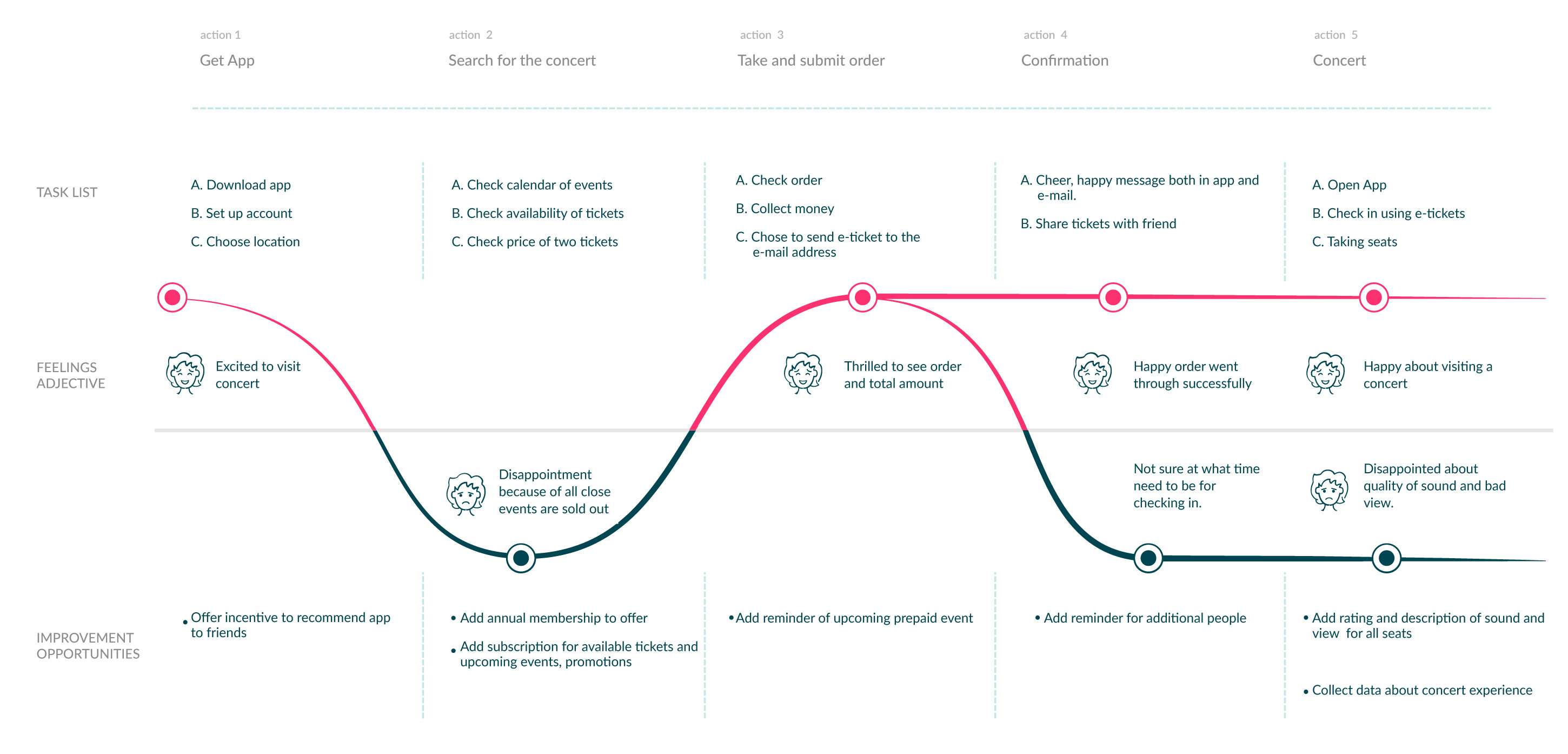
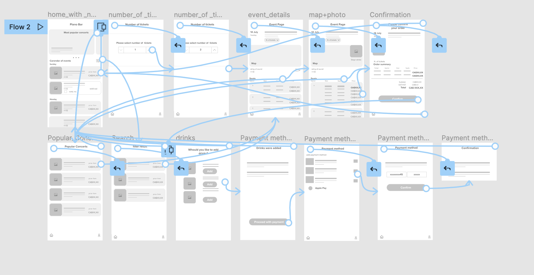
Once I had created a rough concept of the features and how they would be organized, I translated these ideas from sticky notes into mid-fidelity information architecture trees. This helped me understand which screen states and modals I needed to design.
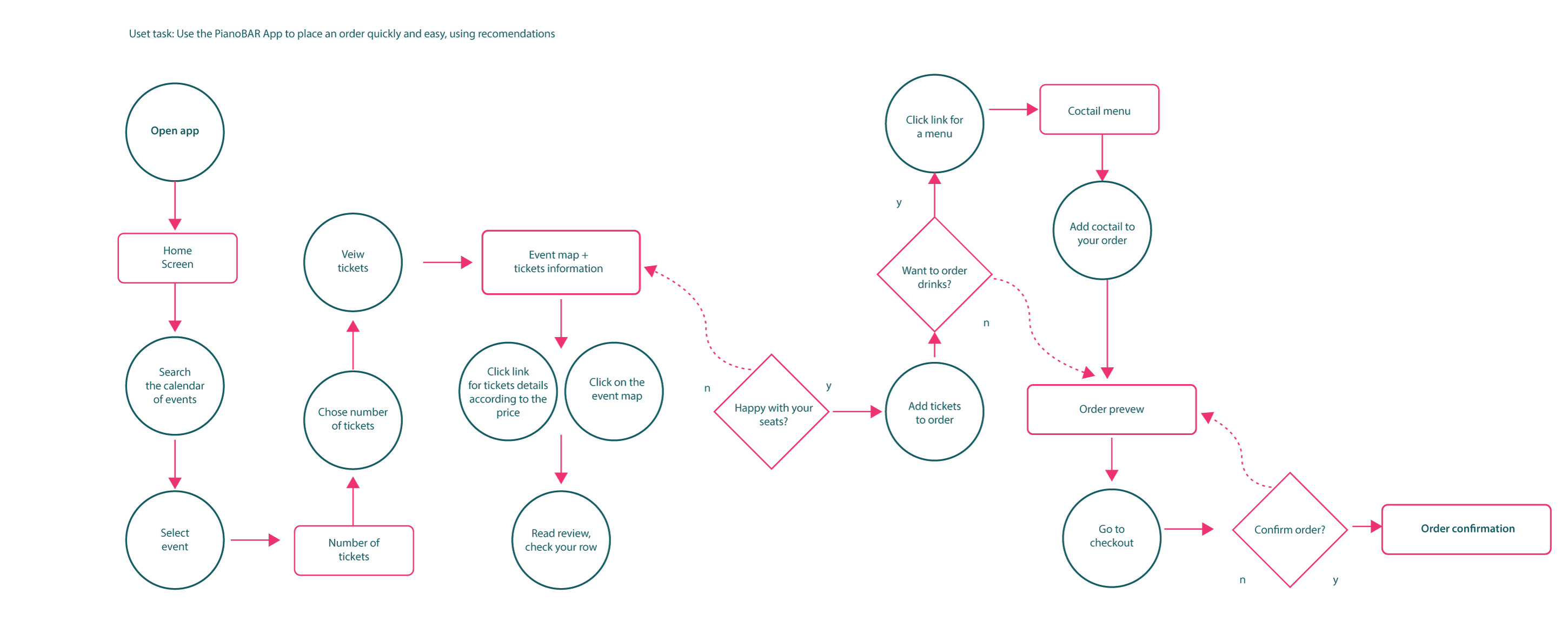
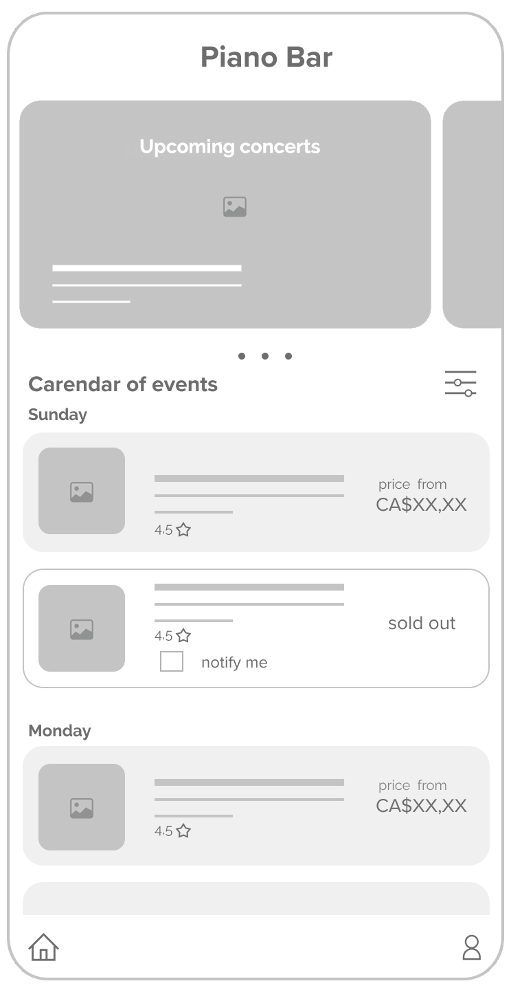
Taking the time to draft iteration of each screen of the PianoBar APP ensured that all elements that made it to digital wireframes would be well-suited to address user pain points. For the home page screen, I prioritized a quick and easy ordering process to help users save time.
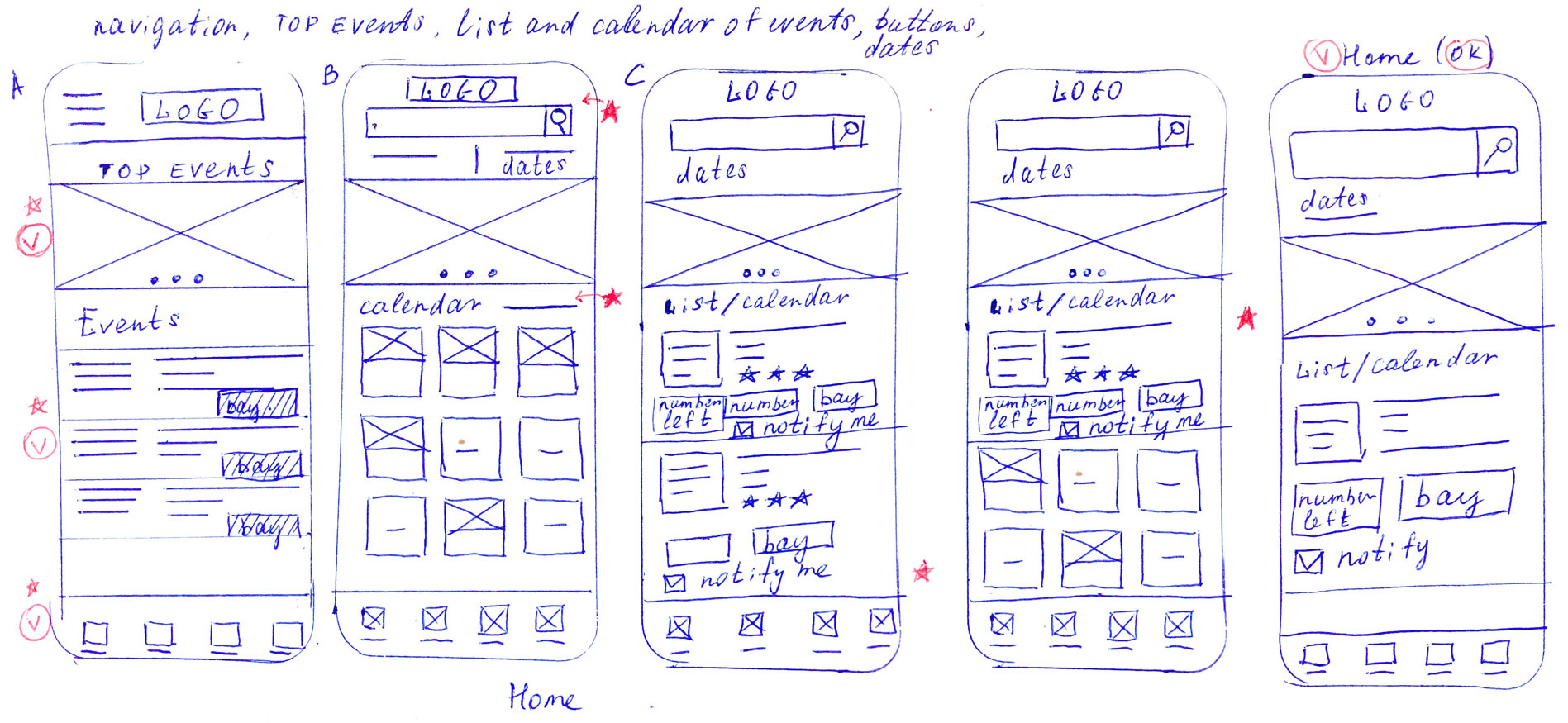
As the initial design phase continued, I made sure to base the screen design on feedback and findings from the user research.
Additional sound and view quality rating is a key to user understanding worthy of best deals.


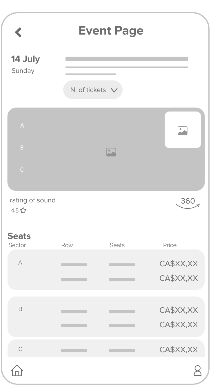


Map of the stage + view photo provides visual information about seats
Using the completed set of digital wireframes, I created a low-fidelity prototype.
The primary user flow I connected was finding and buying tickets for an event,
so the prototype could be used in a usability study.
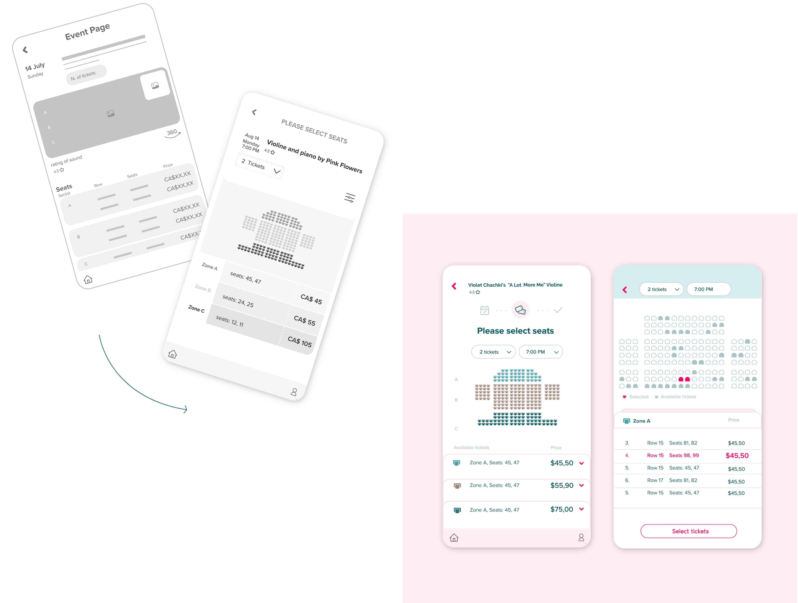
Early designs just showed tickets number on the Event Page, but after the usability studies, I added additional options to change the number of tickets all way long. I also revised a Stage and a Zone location, added a status bar, navigation, headers to make the process of selecting tickets easier.

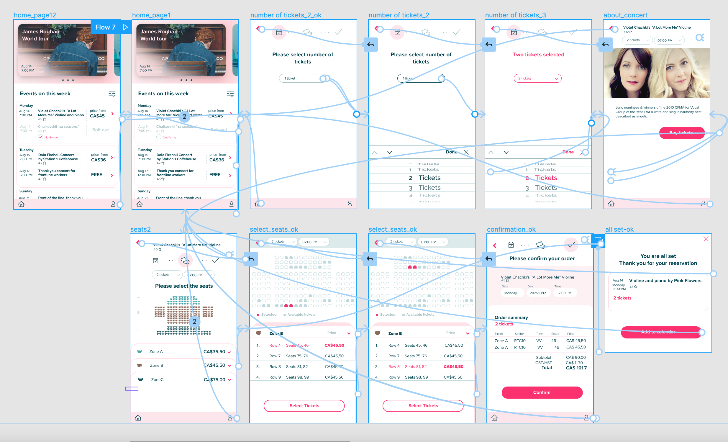
The final high-fidelity prototype presented cleaner user flows for choosing the tickets number, ability to change it all way long. It also met user needs for more clues with navigation.
Hi-fidelity prototype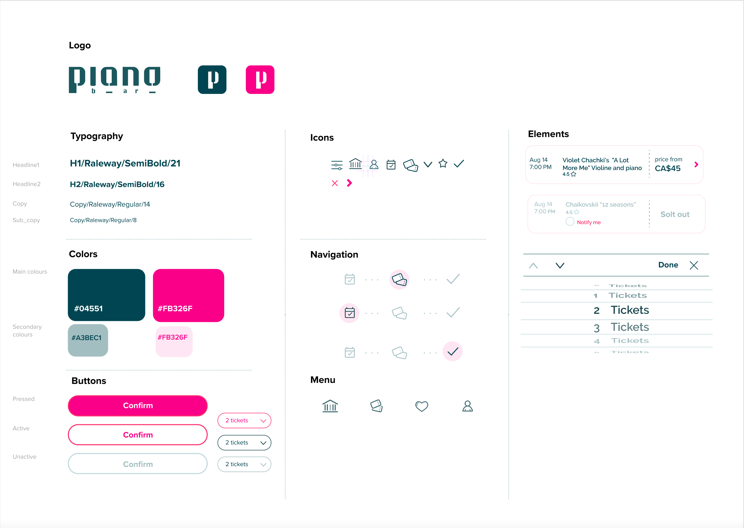
Provided access
to users who are vision-impaired through adding
alt text to images for screen readers.
Used icons to help make navigation easier.
Used additional screen with bigger stage and seats.
If it’s a billboard ad, you’ll need a super catchy headline and simple design due to the speed at which people will pass.
Buy Now | $79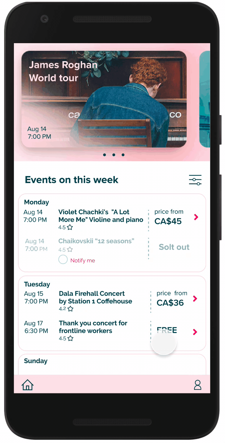
Impact: The App makes users feel like PianoBar really thinks about how to meet their needs.
What I learned: I learned that somethimes you can not solve issue because of technical limits, but you can make user experience better by providing simple solutions. Usability studies and peer feedback help me to find the best user flow which meets use needs.