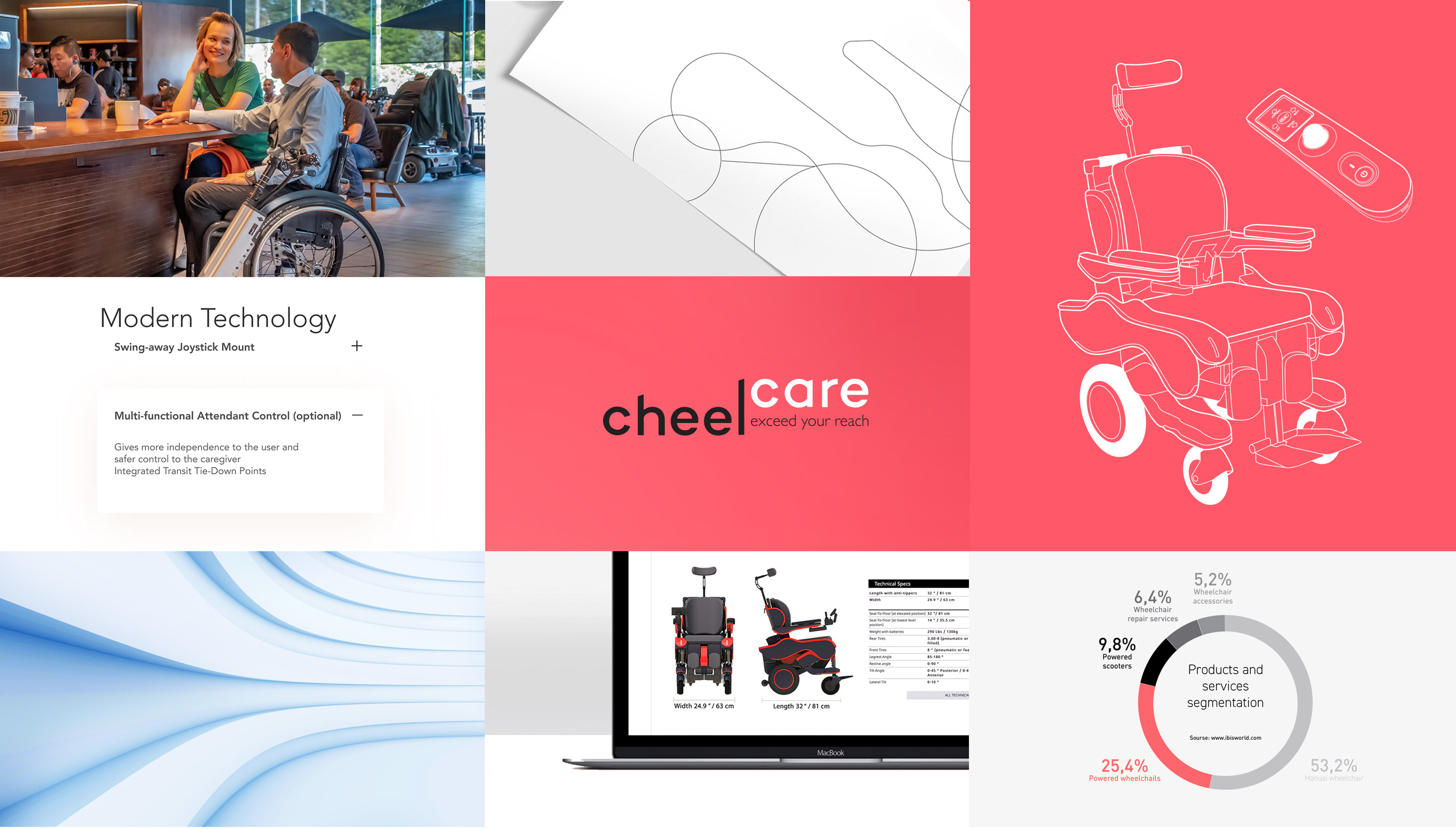
Cheelcare develops a line of modern multifunctional mobility devices utilizing the latest technology to improve the independence and quality of life of disabled people. Compony wanted to update their internet website for a wide range of audiences: dealers, developers, doctors, vendors and end up users. CheelCare’s goal is to make the site easy to navigate and make the accessory shopping process easy and fun.
UX Designer
UX Designer
Conducting interviews, paper and digital wireframing, low and high-fidelity prototyping, conducting usability studies, accounting for accessibility, iterating on designs and responsive design
May 2021 to August 2021.
June to August 2019

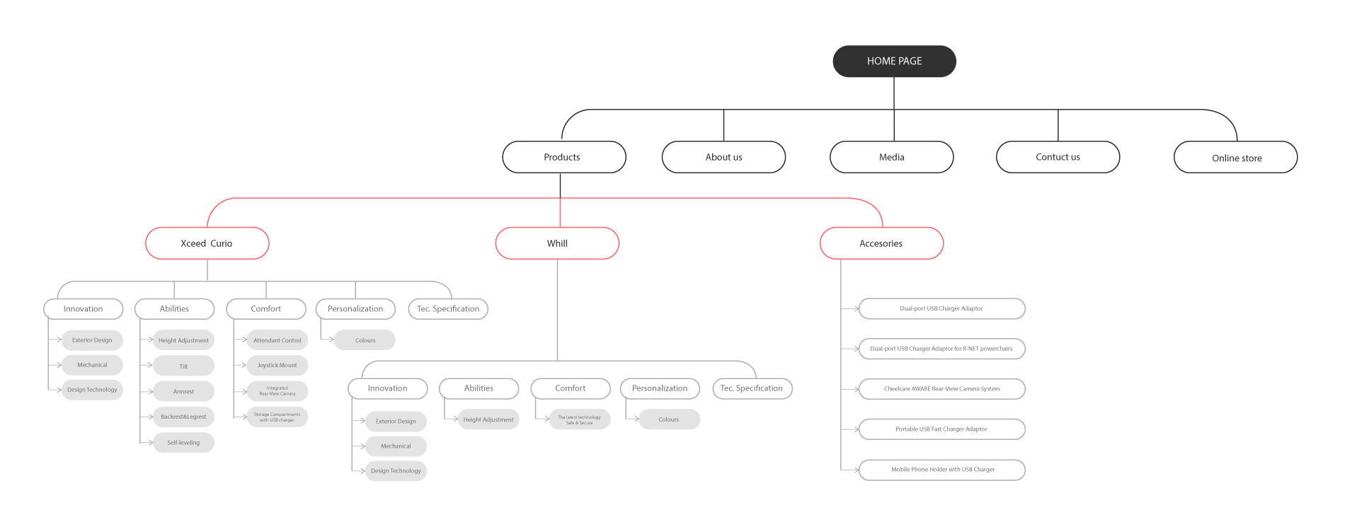
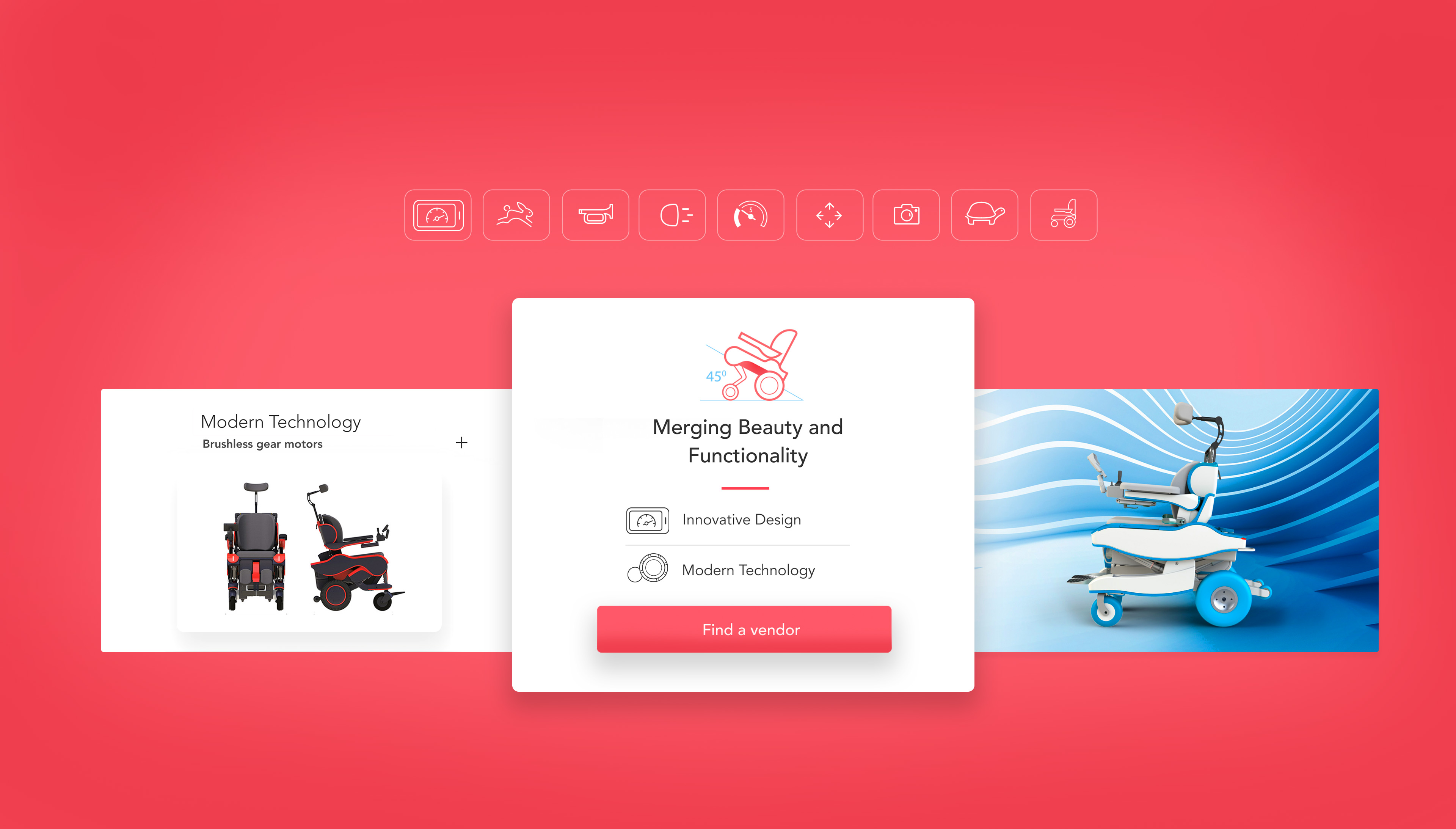
Difficulty with website navigation was a primary pain point for users, so I used that knowledge to create a sitemap. My goal here was to make strategic information architecture decisions that would improve overall website navigation. The structure I chose was designed to make things simple and easy.
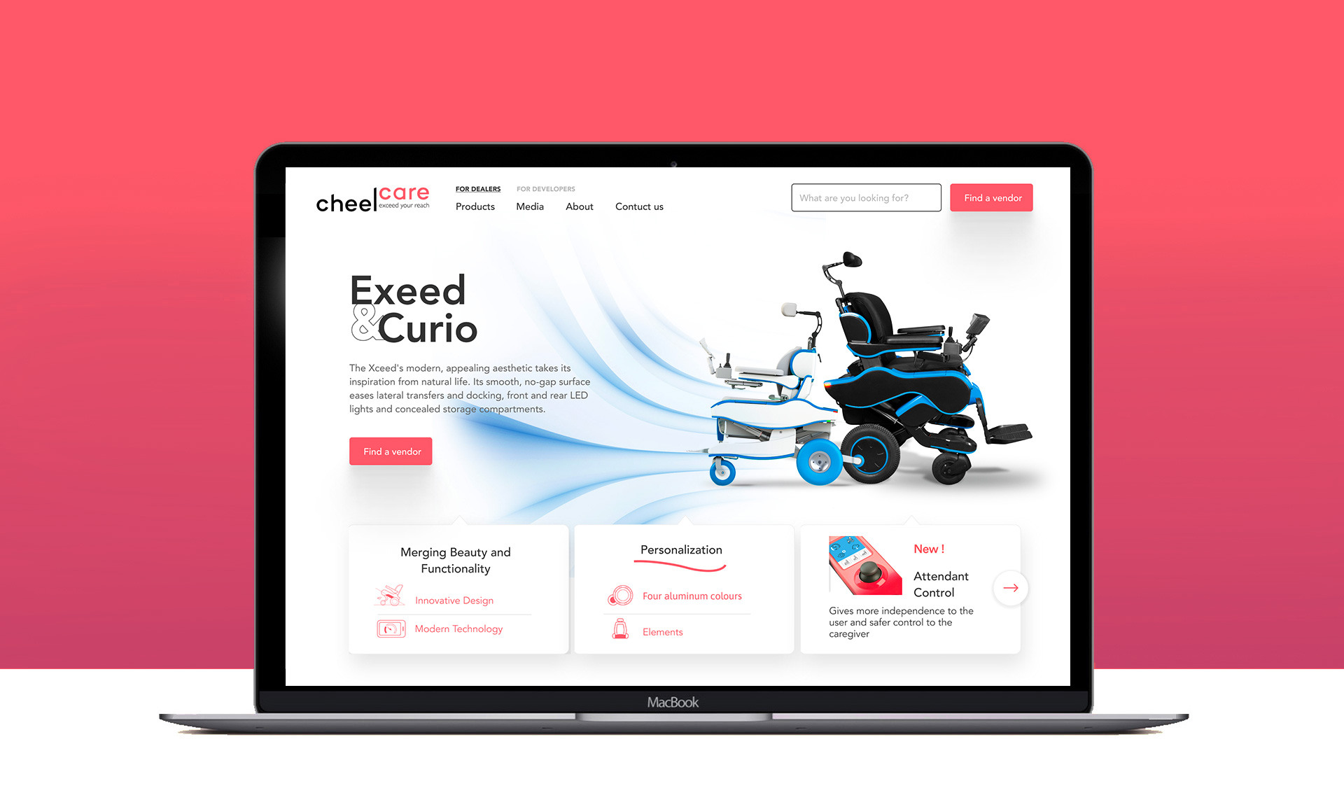
Moving from paper to digital wireframes made it easy to understand how the redesign could help address user pain points and improve the user experience. Prioritizing useful button locations and visual element placement on the home page was a key part of my strategy.
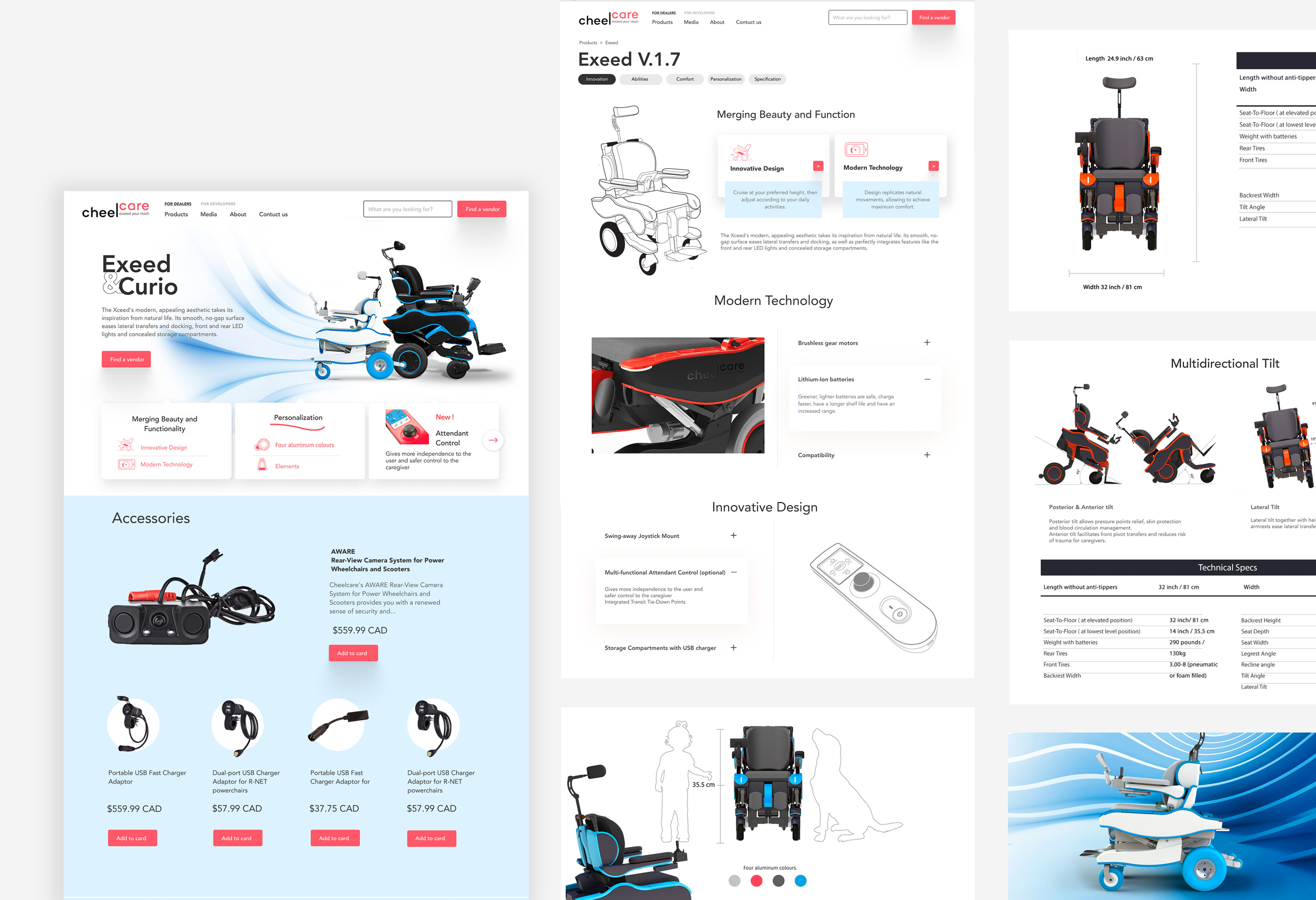

I used headings with different sized text for clear visual hierarchy.

I used high contrast rate for the colors

I designed the site with alt text available on each page for smooth screen reader access
If it’s a billboard ad, you’ll need a super catchy headline and simple design due to the speed at which people will pass.
Buy Now | $79Impact: Our target users shared that the design was intuitive to navigate through, more engaging with the images, and demonstrated a clear visual hierarchy.